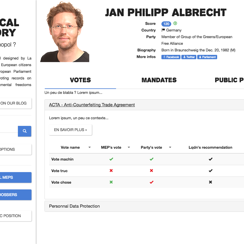
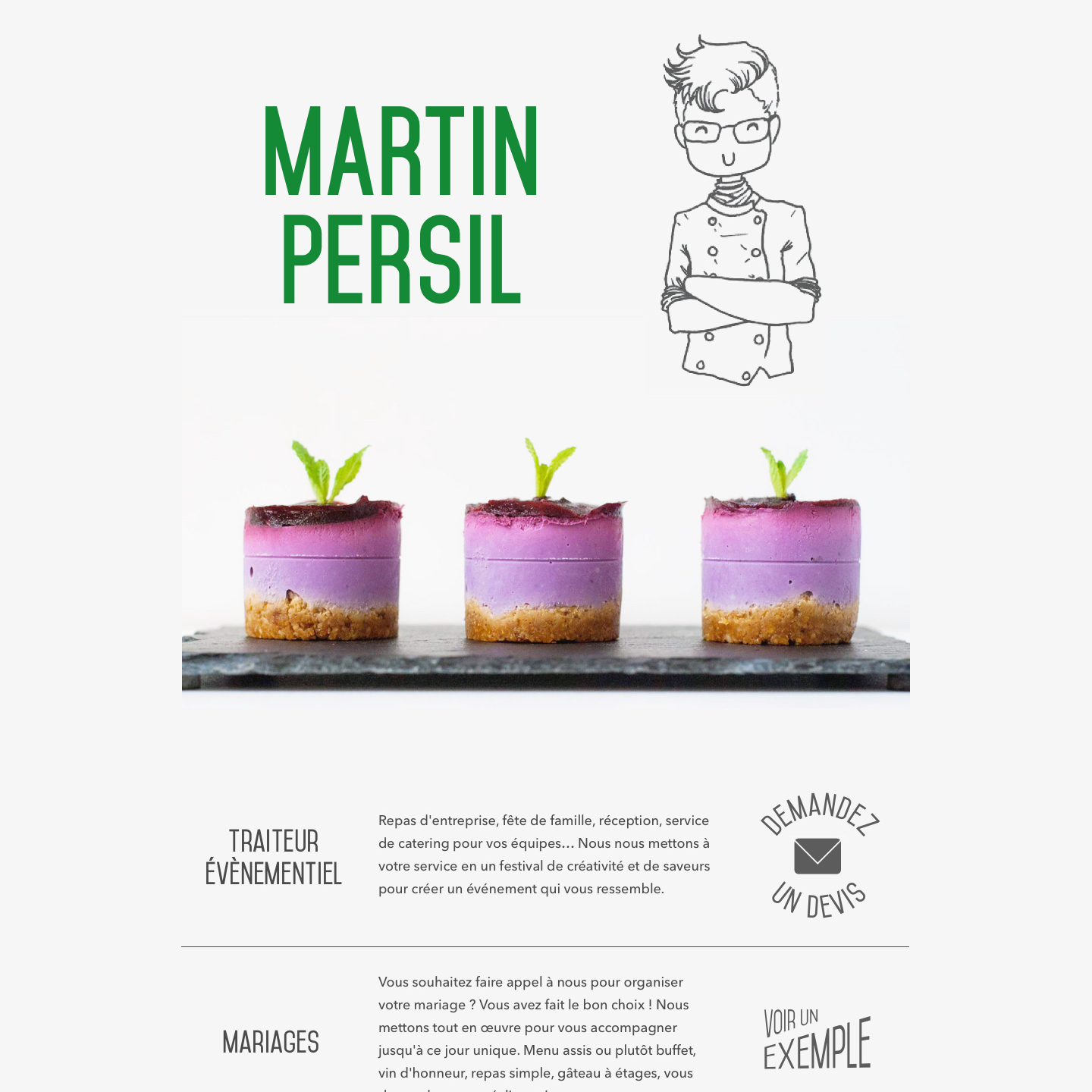
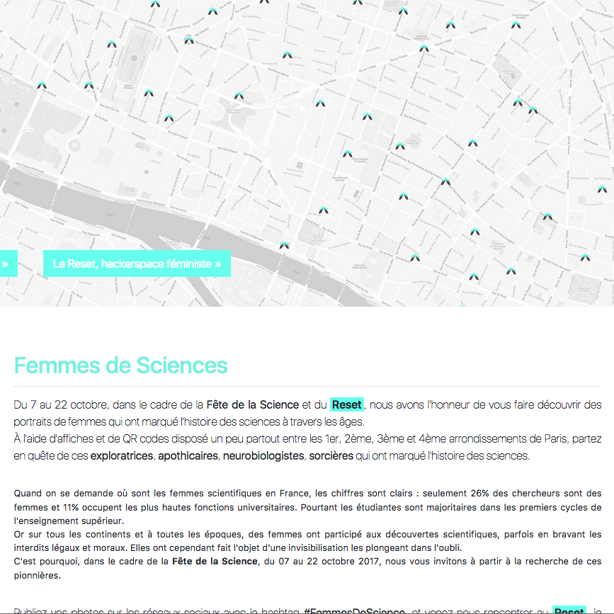
A long time ago (was it 2010 ?) I was a treasurer in a french non-profit organization, trying to pass on never-ending spreadsheets filled with numbers. As no one was ever looking at it, I decided to translate them into charts. Those were ugly, pixelated charts, full of PowerPoint effects such as bad 3D and pre-defined gold gradients. Yet, people started understanding the financial situation of the organization.
I believe finance and design both pursue a similar goal : just as financial work paints the big picture by structuring data through tables and graphs, design is about presenting information to make it available to a broader audience. I use both those tools, for I believe that information is power and that sharing it empowers us collectively. I want to make information accessible : obvious to find, painless to look at, understable at a glance, and straightforward.
Time has passed, and I won't show you those aweful charts from the beginings, but you'll find below some of my most recent projects.